And, Or, But… Following Simple Directions Manual
Contents
Responding to a direct request such as “Show Me” is an important response. It indicates the receptive understanding of the command and the target word, and it shows the ability to demonstrate comprehension using an expressive motoric response. Expressive language can be encouraged by having the person name the target, then use the word in a phrase, sentence, or short conversation.
Play
Tap the Play button to start. A random pair of pictures (target and foil) are displayed on the screen. You will hear the prompt “Show Me…” and the color of the target. Touch the picture that has that color. If the response is correct, the frame will change to green and after a short delay, the next pair of pictures will appear. If the response is incorrect, the frame will turn red and the prompt will be repeated. Tap the incorrect item again to unselect it and then tap the correct item. There is a small speaker in the bottom left-hand corner that you can use for listening to the colors of the item. Tap the “Ear” button to hear the “Show Me…” prompt again.
The app contains prompts and responses that can help the user improve their selection strategies, but ideally, the user will work with a parent, teacher, or therapist while using the app. The mentor can discuss selection strategies with the user and help the user determine why incorrect answers were not correct.
You can use the Settings button to change the number of pictures on the screen and the task. The Levels and Tasks tab lets you set the number of items that appear on the screen and the task that the user is to perform. The Introduction level has two items on the screen. The objective for this level is to get the user comfortable with the tasks. The items on the screen are simple squares, circles, and triangles. In the Introduction level, the user gets immediate feedback on whether their choice was correct or incorrect. There are seven tasks for the user to complete. They will be discussed below.
The Beginning level has four items on the screen. In this level, there is still only one target but there is more variety in the kinds of items that are displayed on the screen. We also introduce the Check It button  . It is located on the bottom right corner of the scoring toolbar. In this level, and all higher levels, when the user taps on an item, the frame turns blue. The user must now complete the second part of the task, checking their answer. If the answer is correct and no incorrect items are highlighted, the frame of the correct item turns green. After a short delay, the next set of pictures is presented. If any incorrect items are selected, the user will hear the “Show Me…” prompt and be given a chance to change their selections. Tapping on a picture will deselect it. When the user is confident that only the correct item is selected, they will again tap on the Check It button. As before, if the correct item is selected—and no incorrect items are selected—the frame of the correct item will turn green, and after a delay, the next screen will be displayed. Otherwise, the frame of the correct items will turn green, incorrect items will turn red, and items that were supposed to be selected, but were missed, will turn yellow. The app will pause so that the user can discuss the screen with their mentor. The Check It button will still respond and the Show Me… button will work, but selection and scoring will be disabled.
There is a little speaker at the bottom left corner of each frame. If the user taps on the speaker, they will hear a description of the item. There are several ways that the user and mentor can use the speaker button. If the user is consistently choosing incorrect items, the user and mentor can listen to each item on the screen. Tap the Show Me… button (the ear at the top of the screen) to listen to the prompt. Select the correct item, tap the speaker to hear their choice, then tap the Show Me… button to verify that the correct item was selected. The speaker can also be used as part of a naming task. For each item on the screen, the user will name the attributes (color, size, number) and then use the speaker to verify their response. And the speaker can be used as part of an error-correction strategy if items are missed or chosen incorrectly.
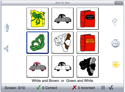
The Intermediate and Challenge levels each have nine items on the screen. There may be more than one target on the screen and the user is expected to select all of them. There may also be more than one of each foil on the screen, so the user can’t just pick the item that appears the most on the screen and expect to get it right. In the Intermediate level, the items are all from the same group. e.g. Squares, Cars, Butterflies. In the Challenge level, the group for each item is randomly selected, so there will be different types of items on the screen.
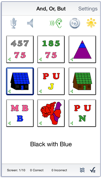
In addition to the four levels, the game has seven tasks. The first task is the And, With task. The user is asked to pick the item that has two colors in it. The word connecting the two colors will be either “and’ or “with”. Sample prompts would be either “Show Me Red and Blue” or “Show Me Red with Blue”.
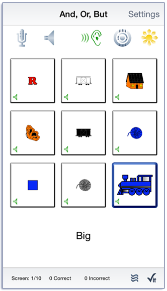
The next task deals with Qualitative Relationships, in other words, relative size. The user is asked to find the “Large” or “Small” item on the screen. In the first two levels, there is only one target item on the screen. The last two levels may have more than one target. Sample prompts would be “Show Me Large” or “Show Me Small”. The target words include, “Big”, “Little”, “Large”, and “Small”.
The next task deals with simple Quantitative Relationships, in other words, relative number. The user is asked to find either “Few” or “Many” items on the screen. In the first two levels, there is only one target item on the screen. The last two levels may have more than one target. Sample prompts would be “Show Me Few” or “Show Me Many”. The target words are, “Few” and “Many”.
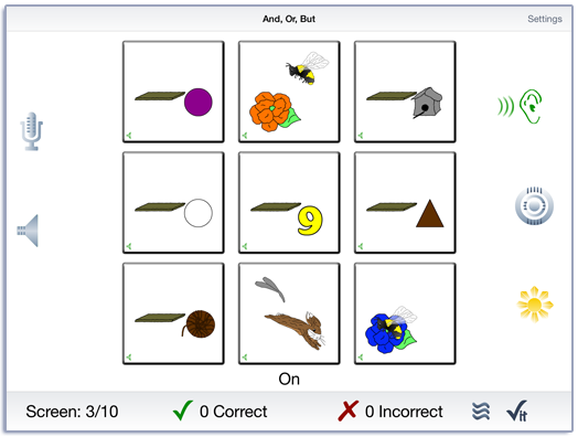
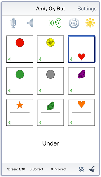
The next task deals with simple Spatial Relationships, in other words, the relationship of a object to its surroundings. This task has several sub-tasks. In the first, the user is asked to determine whether an object is “Above” or “Below” a line in the middle of the item or at the “Top”, “Bottom”, “Left”, or “Right” in the frame. The third sub-task asks the user to determine whether an object is “In” or “Out” of another object in the frame. A fourth sub-tasks asks the user to determine whether an object is “On” or “Off” of another object in the frame. In the first two levels, there is only one target item on the screen. The last two levels may have more than one target. Sample prompts would be “Show Me In” or “Show Me Out”. The target words are, “In” and “Out”.
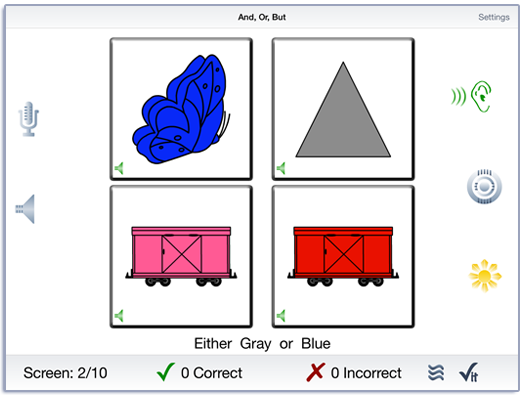
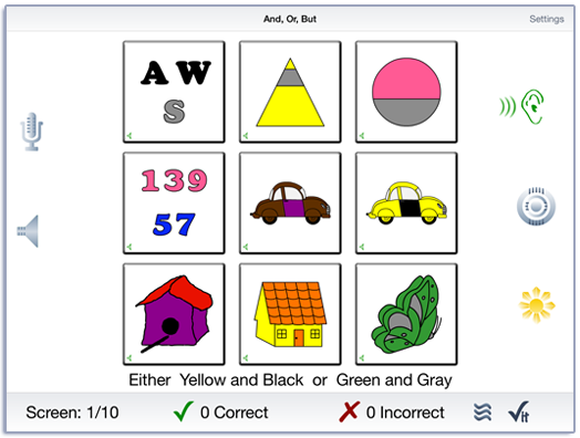
The Or task is a bit more difficult than the other tasks. In this task, the user hears the colors of two objects, but is asked to pick only one of them. The first two levels introduce the concept of one or the other but not both, with single colors. Sample prompts would be either “Show Me Red or Green” or “Show Me Black or Red”. In the Introduction level, only one of the target colors is on the screen. In the Beginning level, both target colors are on the screen. In the higher levels, the prompt contains two colors. Sample prompts would be either “Show Me Red and Blue or Green and Blue” or “Show Me Black and Purple or Green and Blue”. Both of the items will appear on the screen, but the user is expected to pick one or the other. In the higher two levels, one of the targets may appear more than once and the user is expected to pick all of them.
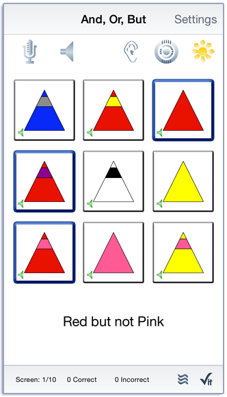
In the Negatives task, the role of target and foil is reversed. The user is asked to select all of the items that do not have the specified attribute. Sample prompts would be “Show Me Not Red and Blue” or “Show Me Not Green with Purple”. In the first case, the user would be expected to select all of the items on the screen that do not have both red and blue in them. In the second example, the user would be expected to select all of the items on the screen that do not have both Green and Purple in them.
The Challenge task has two parts. If the user has selected the Introduction or Beginning level, they are presented with screens from each of the other six tasks. Unlike what normally happens in these two levels, the groups are randomly selected for each item, so the kind of items on the screen may all be different. If the user has selected the higher levels, they are presented with tasks that combine concepts that were learned in the earlier tasks and have more confusing foils.
There is a ”Sunburst” on the screen that is used to show and hide the text of the “Show Me” prompt. Tap the ”Sunburst” button and it will turn yellow. From then on, when you tap a speaker or swipe to the next screen, the text will display below the pictures. Tap the ”Sunburst” button again to hide the text. Note that if there is not enough room under the pictures to display text you will need to swipe to the next screen to see text. The pictures will be resized and the text will be displayed below them.
Touch the Target button to see which item (or items) you were prompted to “Show Me…”. The frame of the target items(s) will change to purple. Tap the Target button again to turn the highlight off.
If your device is capable of recording, there will be a microphone and speaker on the screen. Tap the microphone to begin recording. After a short delay it will turn red. After it turns red, say the target word. Tap the microphone again and the speaker will turn green. Tap the speaker to hear the word played back.
The app keeps track of correct and incorrect responses and displays them at the bottom of the screen. The correct and incorrect numbers that are displayed are the sum of responses on both the first and second time the Check It button is tapped. They are displayed separately on the detailed results page. This allows the clinician to report progress as as response to cues and intervention.
There are three squiggly lines next to the Check It button at the bottom of the screen. The Assistance Required button  can be used by the mentor to indicate that the user had trouble with some aspect of the task and that “Assistance was required”. The app tallies the number of times that assistance was required. The clinician will need to describe the skilled services that were required when writing up the session for a report.
Settings
You view the settings by tapping the Settings button at the top of the main game-play screen or at the bottom of the intro screen.
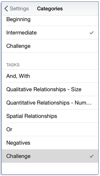
Pick a level and task from the Levels option. There are four levels that determine the number of items on the screen. Introduction has two items, Beginning has four, and Intermediate and Challenge have nine. Except in the Challenge level, the items on the screen are all from the same group of items. e.g. Circles, Squares, Cars, Butterflies. There is only one target in the Beginning and Intermediate levels. The other two levels will randomly have one to four targets. There are also seven tasks. They are: And, With; Qualitative Relationships - Size; Quantitative Relationships - Number; Spatial Relationships; Or; Negatives; and Challenge. They are described in detail above.
You can download the colors, numbers, and shapes as a pdf from our website.
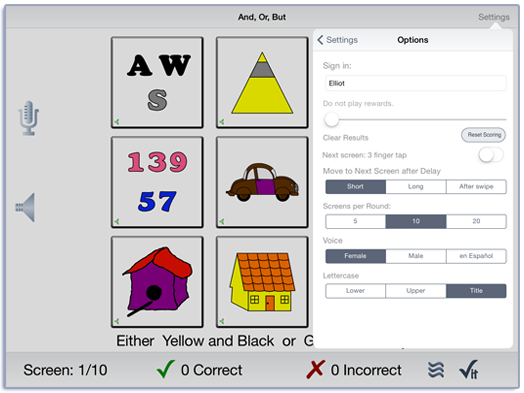
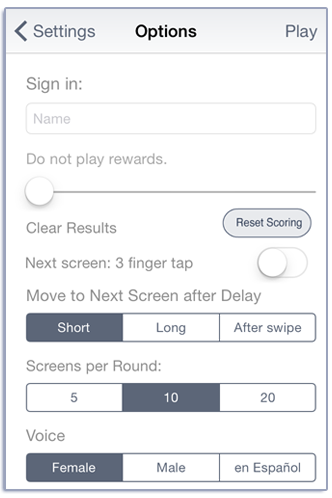
The Options tab lets you customize the game for the needs of your users. When a correct answer is chosen, the default behaviour of the app is to move to the next screen after a short delay. This can be changed to a long delay or require the user to always swipe to move to the next screen.
Some users may find it difficult to tap on the screen without also sliding their finger across the screen. The app will interpret the gesture as a swipe and move to the next screen. You can change the swipe-to-next screen gesture to a three-fingered tap with the Tap to move to next screen option.
After 10 screens have been presented, a popup is shown that tells how long the user took to play the 10 screens. At this point the results are stored for the group of 10 screens and you can continue to play or use the Setting button to change levels or tasks. This option can be changed to 5 or 20 screens.
The user can also change the voice that presents the prompts to a male voice or to a female voice in the Spanish language. If Spanish is chosen, the text below the items will be displayed in Spanish.
The text can be displayed in Title Case, where all of the words except the connectors start with a capital letter. The display can be changed to all lower case or all upper case.
You can sign in with the child’s name and the app will remember the name until you change it. If you enter a name the results files will be stored with the name appended. e.g. Show And, Or, But Results User One 2015-04-27.html
When you change the name a new file of results will be created. If you want to clear out the current results file, but not change the name, you can touch the Reset Scoring button.
The Rewards slider lets you play a simple reward after a certain number of screens have been played.
The Results tab shows the results for the day. For each level and task, the Correct, Incorrect, and Missed items are displayed. The detailed results page also displays the scores by first try and second attempt. The number of taps on the Assistance Required button and the time per group of trials (5, 10, or 20) are also reported. A new results file is created when you change the “Sign In” name or when the day changes.
Viewing Results
You can email or print the results using the button at the top of the results page. The printed results include percentages as well as raw numbers for the responses. You may also use iTunes to copy the day’s results file to your computer for printing or archiving. To view the results pages in iTunes, plug your iPad or iPod into your computer. Open iTunes. Under Devices you’ll see your device. Click on the device and look at the top of the screen. You will see a tab labeled Apps. Under that tab, there is a section for File Sharing. The name and icon for this app will be displayed. In the documents list next to it you will find all of the results pages that are stored on the device. Drag them to your desktop. They will open in your web browser where you can print them.
Rationale
Responding to a direct request such as “Show Me…” is an important response. It indicates the receptive understanding of the command and the target word, and it shows the ability to demonstrate comprehension using an expressive motoric response. This app extends the concept of following simple one-step instructions and adds linguistic complexity. The child will learn to follow extended one-step directions with common linguistically complex terms including: And, With, Or, Few, Many, Big, Little, Large, Small, Above, Below, Left, Right, Top, Bottom, In, Out, Not, But, and Both.
Expressive language can be encouraged by printing out the color PDF pictures and the Word Cards to make your own Following Directions card game. The child can practice giving and receiving verbal directions.
The format is intentionally low key and simple in order to provide an uncomplicated background for learning these concepts. The multisensory approach requires the child to listen to directions, repeat information aloud, and touch the screen to make choices.
Credits
Created by Nancy Scarry, MFA. Graphics are by Nancy Scarry.
Screen Shots from iPhone and iPad
